Photoshoot in Dover - My post-processing workflow
What is nice being a member of a camera club or a photographic society is that you get to meet other photographers that you can learn from or teach to which both makes you improve yourself. My first ever photographic society is the Ealing and Hampshire House Photographic Society (EHHPS), I joined the club as it was the closest to my place and just like it a lot even though I'm one youngest members. Most of photographic societies exist for a very long time and their members are members since long time ago, but it's really interesting to join as you will have different points of view and submitting your work into the local competition is always interesting.
Among photographers I've met at the EHHPS, there is Frank Williams that you already know from my photograph called "Attack of the autumn leaves". We've been mates since then and went shooting quite a few times together. Recently I've been getting in touch with Shaun Hodge another great photographer from the same club. After talking about flashguns and photoshoots he invited me to join him shooting for a dress maker friend of his. The shoot would be taking place in Dover and we would have a MUA (Make Up Artist).
So on that Saturday I woke up at 4.30am to get ready as Shaun was going to pick me up at 5am... I'm not an early person... but to get good pictures you need to make some efforts. So there we went for about 2 hours drive. In the car I got presented to Giovanni the dress maker, Giuseppe the dancer which is going to be modelling for us and Bettie the MUA who turned out to also be a model. What a great team, the day seemed to be very interesting and the cherry on the cake was a lovely and bright (too much maybe... but was cool though) sunny day with a deep blue sky. In the UK you quickly learn to enjoy the sun.
7.15am, Dover here we are! With the help of Google Maps on my iPhone we found the location that Shaun has spotted on the desktop gmaps, straight on the edge of the white cliffs! The view is impressive and if you are affraid of height, better not get close because there are no fence, it's a direct jump to the bottom!
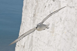
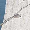
Hungry we all were but there was no sign of any pub of coffee shop around. We will need to go down the cliff later on. But the excitement was so strong at the view of that fantastic landscape that it makes us forget our stomachs and concentrate on our duty. Well at least for Bettie, Giuseppe and Giovanni... While they were busy getting ready with the make up and the outfits, Shaun and I took the opportunity to get about one hour warm up shooting... seagulls :-D
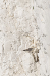
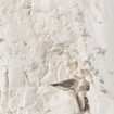
I got close to the edge of the cliff and carefully take a shot of the birds' nest on the face of the cliff. You could hardly separate them as the colors of the seagulls and the chalk cliff just merge perfectly. The brightness was such that my iPhone camera just underexposed most of the shots. But that is for another post...
Far away I could see a SeaFrance ferry. I was on the same ferry 3 years go moving from France to the UK on my little Peugot 205, that has been scrapped a week ago... sad... :-(
Shaun lent me his Nikon 70-200 f/2.8 VR. What a wonderful lens! I played with it all day long. Thanks mate.
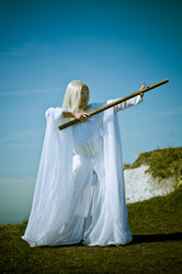
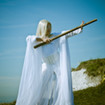
About an hour later, they are very perfectionnist, we started the shoot. As Shaun told me before, Giovanni is very talented and the outfits he created are always amazing. This first one was a long pure white robe, stunning piece of work! Giuseppe was wearing a golden wig, he just looked like a character out of the "Lord of the Rings".
Before showing any image, lets go forward in time and talk about the workflow after the photoshoot:
Day 1 - After the photoshoot:
- Launch Lightroom and import the images from the CF card into the computer. Make sure that I'm applying the correct Metadata set and correct color calibration profile (Nikon Neutral).
- Launch my homemade little script using rsync command line to backup my files to an external drive. An additional backup is done by the Time Machine (Mac OS).
- I won't format the card until the next photoshoot, just in case...
- Flag out all bad pictures (bad composition, bad lighting, bad expression etc...) and on the same go flag the interesting ones. I can then delete the bad ones later on.
- Toggle the flag settings to just display non bad pictures and here I go for a second round flagging great ones and unflagging not so interesting photographs.
Day 2 - Quick corrections:
- I'll now go thru all the flagged pictures and start some quick corrections to them, batching the work on similar images in terms of WB and exposure.
- I will also crop out any un-interesting area (too much sky, too much sea, too much foreground etc...). Anything that does not bring strength to an image is bringing weakness to it, so get rid of it. You may end up with a square image, a pano like image but it will be a stronger one.
- Cloning out some areas is also sometimes needed: unwanted object, dust on the sensor etc...
- It's also time to apply one of those multiple presets for Lightroom that I've found on the net. I'm always looking for new ones or create custom ones based on some forums and online articles. They help me creating dramatic, moody or other look and feel to my picture without me spending too much time on the hundred shots taken on the day.
- Most of the time a trip in the Develop tab of LR is all I need to get my pictures ready to be printed or uploaded online. And so it is the case for this photoshoot except for a couple of pictures that I will discuss further down.
- I personally prefer to spend a bit more days on the work as I often realize that I work better that way. So I pause here and do something else (Twitter here I come!)
Day 3 - Final touch and export
- Lets now quickly go thru all pictures again and see if something I found cool last time is still cool this time.
- If some images needs to be tweaked, then I'll tweak them now.
- Some great images might need the help of LR big brother Photoshop to get even stronger pictures. And it is a must if I was shooting headshots as I need to skin correct the faces.
- That's it, I can now export my RAW files or TIFF out to JPEGs using my custom export preset to export a version for Flickr, my blog or any where else.
Already 40 minutes spent on writting this post and I still need to write more! That's the hard life of a photographer blogger. But it's always a pleasure to share my knowledge to you guys, so please let me know you appreciate it in the comments area below or on Twitter @qhphotography
I usually like to start with the Nikon Neutral profile. But then I might want to switch to Nikon Portrait, Standard or another... This all depends on the pictures I get and what I feel when I look at them. Is the preset bringing strength or emotion to the picture? For Giuseppe pictures Adobe Standard was the way to go. It renders the sky nicely and makes the robe stands out. I'm usually tempted to use one of my favorite Develop presets "300", "Dave Hill like effect", "Kabam It", "Cross Processing", "Dream", "Lomo", "McDreamy", "Red Head Sepia". Most of them is using strong color and lighting change to the picture and add more or less vignetting to drag the focus to the subject.
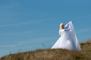
The picture on the left is what I usually try to get. The vignetting is keeping the viewer attention to the center of the image where my subject is. This picture is quite good, nothing wrong with it except that there is something wrong for me though. It's just the way I feel when I look at the original image for the first time. I see a clear sky, I see a golden hair Elf in a pure white robe so for me it just needs to be a bright pure and clear image, no darkness, no vignetting or maybe some reverse vignetting. Instead of darkening the corners I could maybe brighten them? That is what I used for some other pictures.
So let see what we can do with the following photograph:
Looks cool, the sky is blue, the grass is not green green but the color is good against the blue sky. I love the pose of the model, it creates a triangle shapes. And I know from listening again and again from photographic societies judge that triangles are good. And yes they are! No diagonal but it's OK. So this pic has a great potential. What can I do to improve it?
- Clean out from any dust spots
- Play with exposure, brightness etc... to make the image brighter keeping a good lighting on the robe, important!
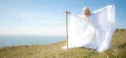
- The adjustment brush is a fantastic tool to change exposure or other settings on a selected area. Here I've brighten the face a little and change the clarity settings on the robe to smooth it and make it glow. I want a feeling of purity and heavenlyness.
- This shot I haven't used any flash but Shaun or maybe Bettie at that time held a Tri-Grip reflector and was bouncing the sun back to Giuseppe from the right. Whereas on the picture above there was no flash nor reflector and the robe lacked of 3D feel to it (now I sound like David Hobby... If you don't know who David is then you should just jump to his blog!). Getting the good light is the key, remember, photography is all about light.
- Now look carefully to the image. What do you notice? What I see is load of sky. It's overwhelming! CROP! CROP! chop chop!
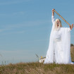
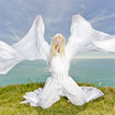
And here is the final result as I imagined it along with a second picture with the same settings but over-exposed. The image was originally over-exposed but I exagerated it a bit and tweak it to make an error a good one:
But as I wanted to have a variety of feel and mood, I of course used different presets and settings of other images that you can view at the end of this page. Please let me know which one is your favorite.
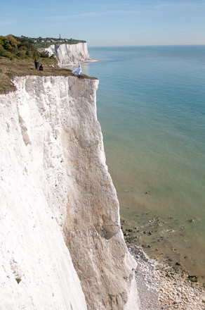
Just for the context here is a view of where we were, impressive isn't it?
Thanks to Bettie for the make up. She was awesome and made a lot of effort to get this photoshoot to this level! And not only is she a great MUA but she is also a fantastic model! So of course she posed for us, after lunch of course cuz with all the good will that we had, our stomach was crying for some food. So we went to St Margaret's Bay and I had a nice Cheese Burger :-D Then we started to scout the bay trying to get close to the cliff but unfortunately the tide went up already so we ended up shooting on the pebble beach on what was left from the chalk face of the cliff. As Bettie and Giuseppe got dressed, I went to our picked location and start analyzing the light we got there. I found a place in the shade which is good for playing with the flash and balancing it with the ambiance.
I ended up with this shot. As you can see one of my regular mistake is that I tend to get too close instead of trying to get the environment into the picture. This is a habit from loving headshots, I always tend to get close so I can get rid of the crap backgrounds and see more of details of the face. And on a small LCD screen it's easier to check a close up shot than a wide one. But now I'm trying to choose better backgrounds and the D300 has a bigger LCD :-) It's not bad to have habits, but try to change them if it can help the image.
Then Shaun wanted to shoot Bettie near the sea with the cliff wall at the back. I followed and added my salt and pepper.
Starting from top left to bottom right:
- This first photograph has been slightly retouched just for the lighting. Just to show you what you get from just the ambiance light, a sun high in the sky nearly above the model (11am!). Not a good light. The face is completely in the shade, we only get highlights on the hair the left arm and the right naked shoulder. And the background was a bit cold.
- So I added a silver umbrella with a SB-600 at camera right at about 45 degrees from the model (if memory serves). And added a SB-800 with a CTO gel on the ground at camera left. Both flash were in manual mode and at about 1/2 power each (if memory serves again, the ambiance was quite bright so it should be that...). Now you see that the face is now standing out with a bit of catch light in the eye and we get a warmer picture.
- I was still not very happy and moved the umbrella more to the her side at camera's right. As expected the angle of the flash created some shadows across her face which I didn't like for this shot so I asked Bettie to look at the umbrella (as you click on the image to zoom in, you will see the flash gun at the top right corner of the picture. This reveals the position of the umbrella)
- Then I played with few poses and also clamped the SB-800 on the ground to the lightstand and have both flash to full power in order to minimize that bright light in the background. It worked... a bit... the sky was very bright! In post-processing I played with exposure, black clipping etc... to darken the background.
- I ended up using "Kabam It" preset which darken the background even more keeping the brightness of the robe with some vignetting.
- An attempt with the "300" (from the movie name) preset.
But the best photograph of the day is to come. It took me hours to processed it and I needed a more powerful tool than LR. So PS came to help.
I love the composition of the first image. It breaks the rule of "if the model looks to the right than give more space to the right" but who cares?! It works that's what matters. But then I prefer the hair and position of the hands as in the second photograph. Her right hand was in such position that the sleeve is hidding part of the robe giving her a better shape. And finally I wanted to give an effect similar to the picture 5 above.
So I prepared the image in LR so that they looks the same and as close to the final result as possible then opened both images in PS and here is what I've done:
- Copy and paste the second image as a layer on top of the first one.
- Mask the second image to reveal only Bettie's face and left arm/hand.
- With the brush tool, tweak the mask at 75% opacity on the brush.
- Add an adjustment layer with clipping mask to make match skin tones from both pictures.
- Set all layers in a group and duplicate the group three times.
- Flatten each of the new group into a single layer.
- The first new layer (lowest) is to sharpen the image with the High Pass Filter technique.
- The second layer is to correct and smooth the face masking all the rest out.
- The last layer will receive a Lens Blur filter.
- Now all the picture is blurry because of the Lens Blur filter. I will use the mask and gradient tool to revel sharpness in a line right where she is standing and progressively go to blur on the background and foreground.
- With the brush tool I will now reveal sharpness on Bettie. But then because of the Lens Blur filter, I get a halo around Bettie.
- To correct this I will select the blurry layer and use the clone tool and clone the background back onto Bettie's halo by re-sampling regularly on the background next to the halo area.
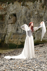
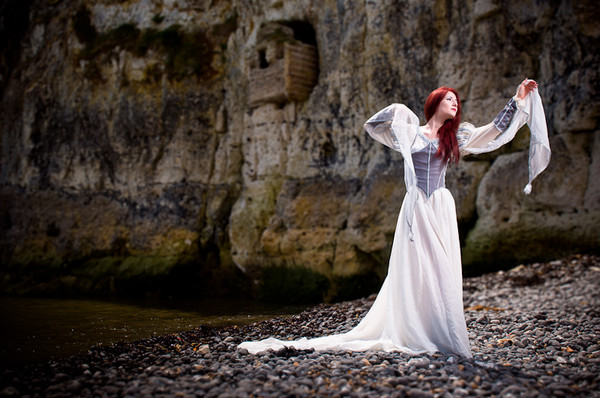
And here is the result, tada! I call it "The Princess of St Margaret's Bay" (see it on Flickr: here)
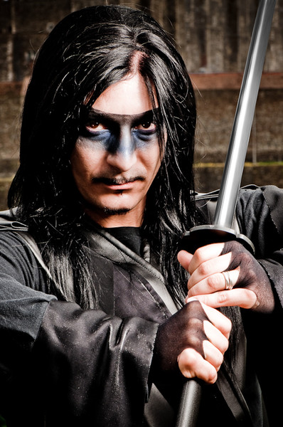
Here is my other favorite picture of the day, "The Warrior":
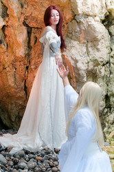
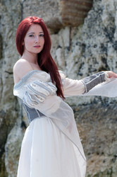
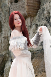
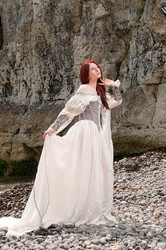
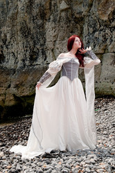
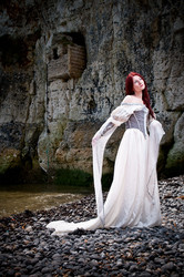
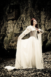
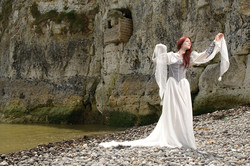
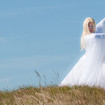
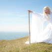
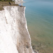
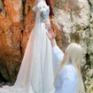
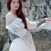
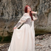
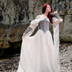
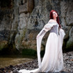
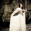
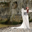
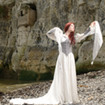
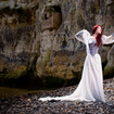
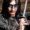
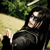
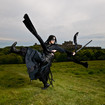
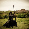
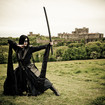
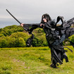
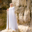
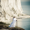
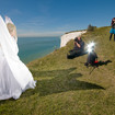
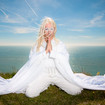
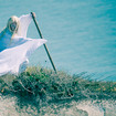
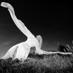
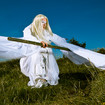
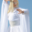
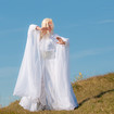
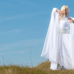
Please see below and enjoy the other photographs taken that day. Your comments are always welcomed!





Comments
Dover
Saturday 25 July 2009 9:17:25 pm
Commented by Shaun Hodge
Shauns Studio
Wow
Sunday 08 November 2009 12:52:43 pm
Commented by Robert Hammar
Robert Hammar Photography